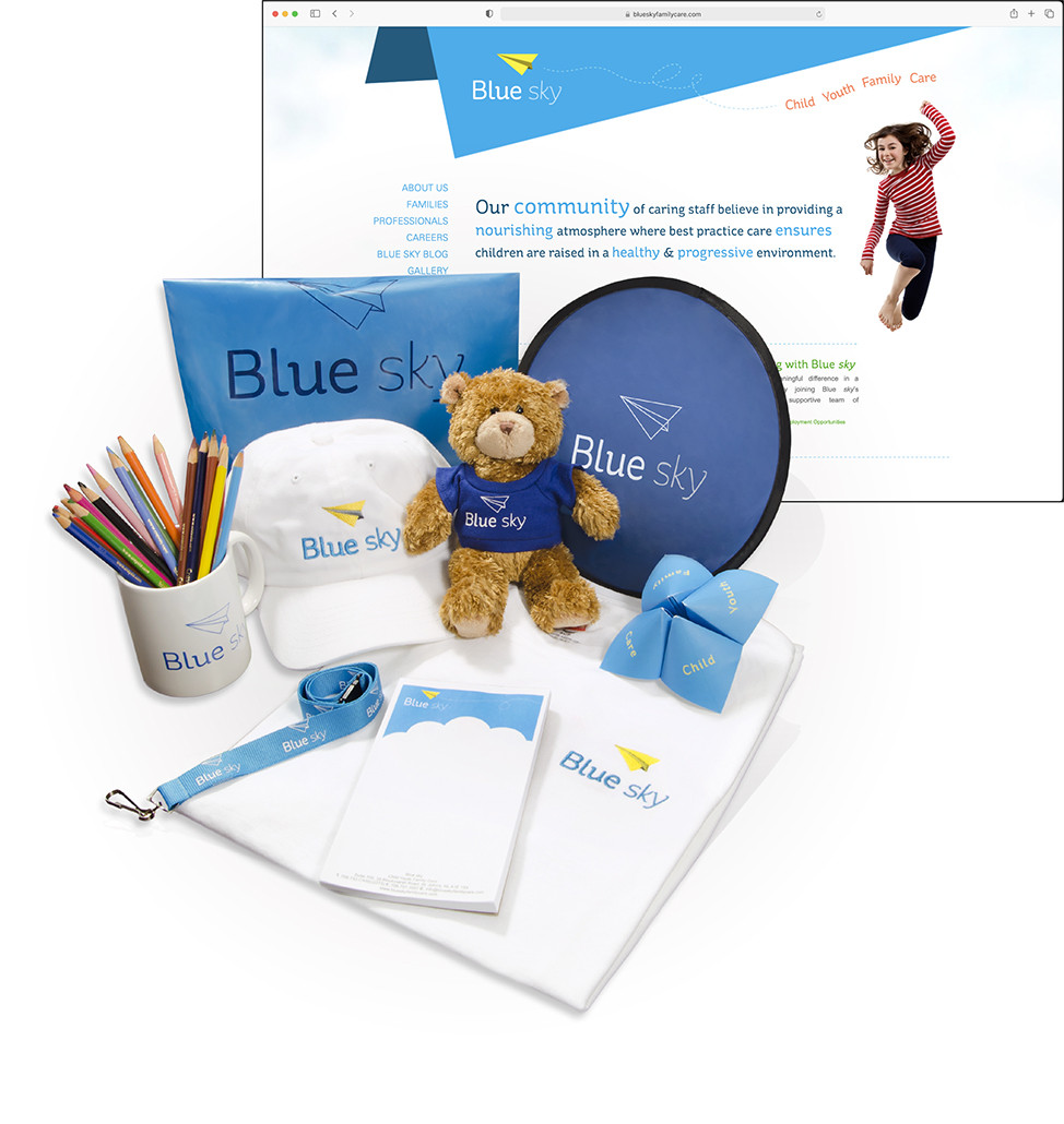
Seafair Capital; Blue sky Family Care
To create a new brand identity for their child and youth residential care division. The goal was to put a public face on a level of service that is very personal to families and children in care.
We worked closely with CareGivers to develop a brand strategy which laid the foundation for the creation of Blue sky. Blue skies are universally positive and symbolically optimistic with connotations of clarity and direction. We chose a paper airplane as the mark as it has connotations of simple fun. We believe the new logo reflects Blue sky’s core brand value which is the belief in the infinite worth of children and youth, and their unlimited potential to grow in mind, body and spirit.
The official unveiling of Blue sky and its brand was held November 2011. This included the new logo, tagline, stationary package and advertising concept. The launch event showcased the brand identity to clients, staff and other stakeholders and was met with great enthusiasm. Blue Sky embodies the hope, strength and guidance provided to families of children in care.